- PEOPLE REMEMBER
- BRANDS, NOT BUSINESSES
Let’s make your business a brand.


Fat Frog Branding & Design Studio, We specialize in crafting unique, high-quality packaging solutions that not only Safeguard your products but also enhance your brand’s identity.
Rebranding, Brand Identity Design, Brand Guidelines, Brand Strategy , Communication Creative Design, Packaging Design
Your Health, Our Homeopathic Expertise.
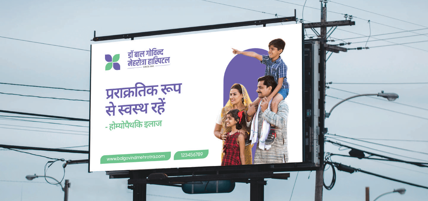
Rebranding is more than just a new look—it’s a transformation that reflects growth, vision, and purpose. At Dr. Bal Govind Homeopathic Mediclinic, we are embracing a refreshed identity that aligns with our unwavering commitment to holistic healthcare.
This rebranding initiative is designed to enhance our connection with patients, strengthen our market presence, and reinforce the values that define our approach to wellness.
Rebranding Dr. Bal Govind Homeopathic Mediclinic is a strategic step to modernize its image and better serve evolving patient needs. In homeopathy, trust, credibility, and recognition are vital, and a strong brand reinforces these values. This transformation reflects the clinic’s commitment to holistic healing, enhanced care, and professional excellence, ensuring a stronger connection with patients while upholding its mission of natural and effective healthcare.
Over the years, our clinic has grown in expertise, services, and patient trust. Rebranding helps showcase this evolution and ensures that our identity resonates with the contemporary healthcare landscape.
Through rebranding, we introduce modernized communication tools, improved clinic environments, and accessible digital platforms.
A refreshed brand commitment to excellence, innovation, and patient care. It assures our loyal patients that we are investing in better Future.
The healthcare industry is dynamic, and rebranding helps us stay relevant by aligning our identity with current trends while continuing to uphold the timeless.
As a trusted healthcare provider in Lucknow for years, we believe it’s essential to evolve alongside the needs of our patients. Our rebranding signifies our dedication to offering more comprehensive services, better patient experiences, and enhanced accessibility while preserving the values that have always defined us
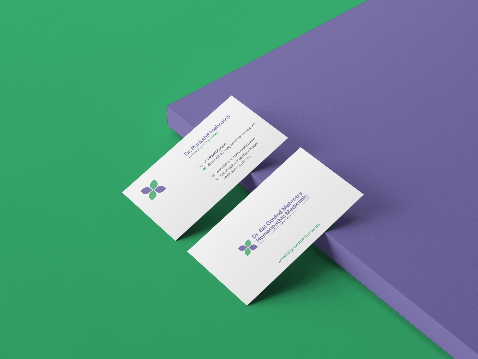
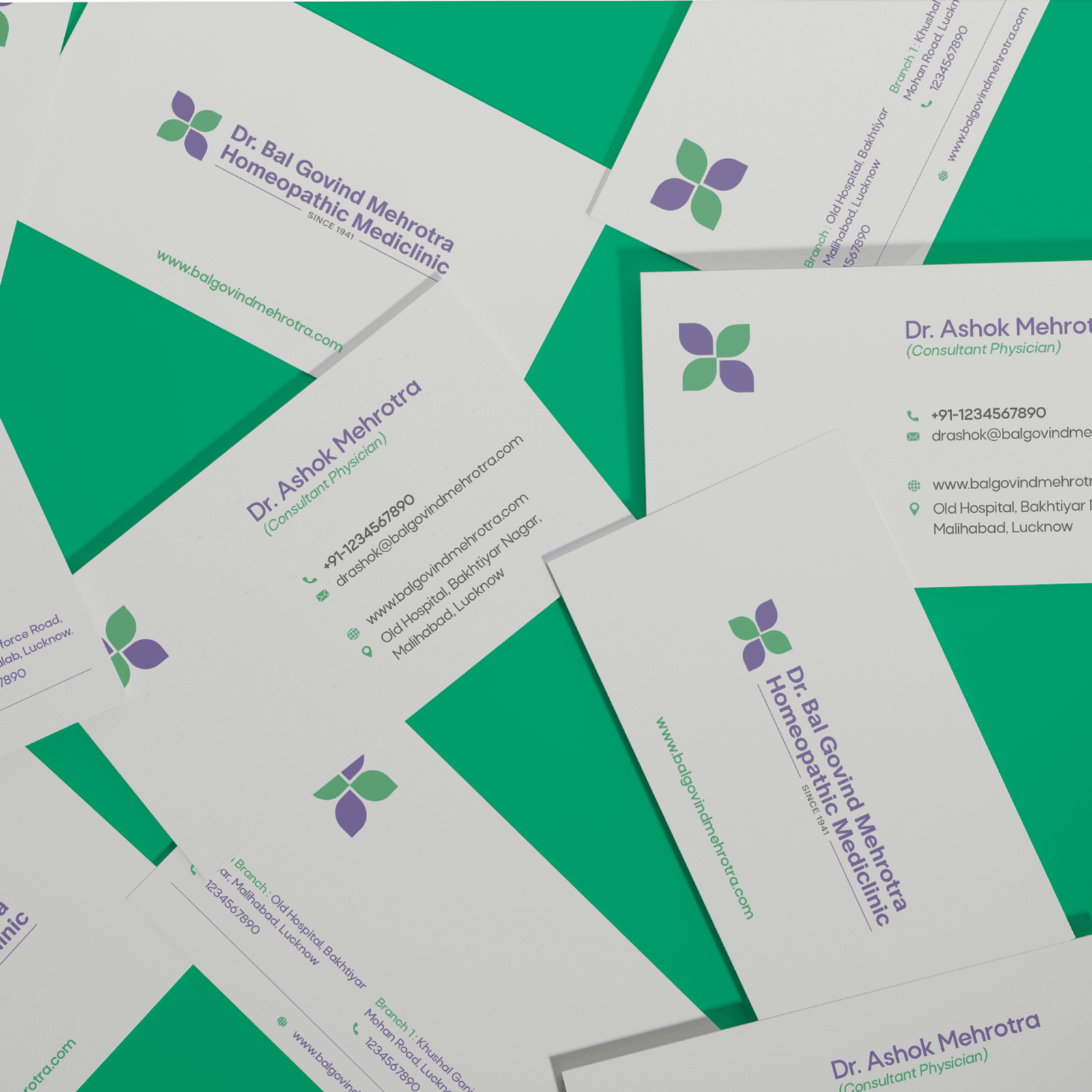


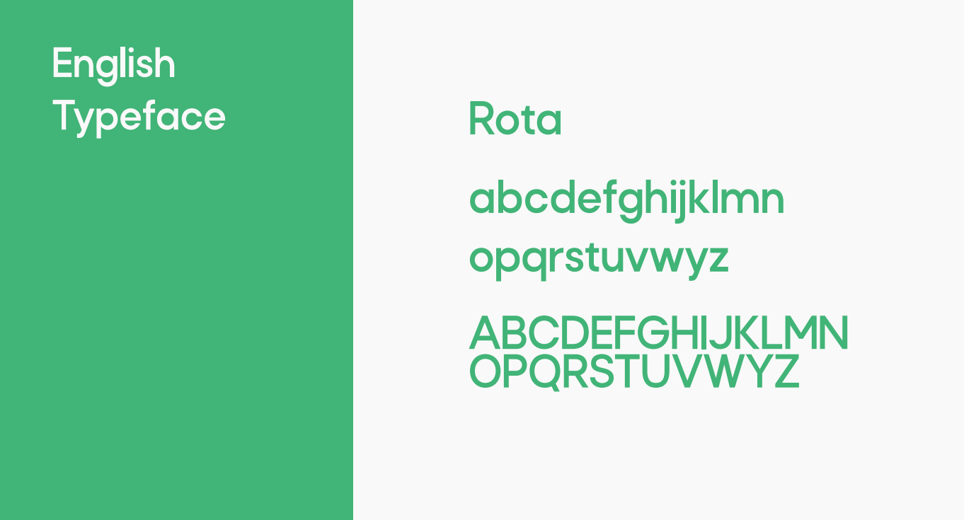
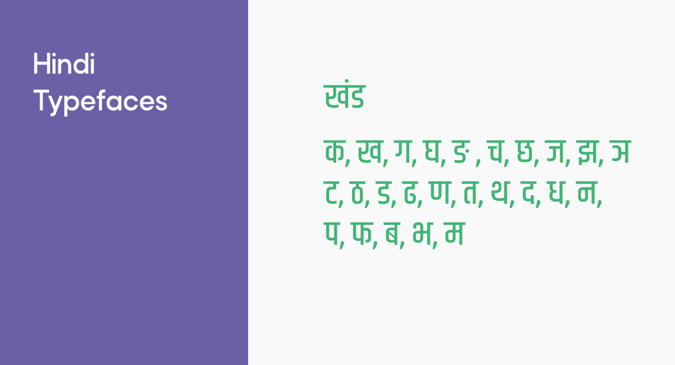
The typography for Dr. Bal Govind reflects the brand’s core values of trust, heritage, and holistic care. A carefully selected blend of classic and modern typefaces ensures both readability and a refined visual identity across all brand touchpoints. The primary typeface is a serif font that conveys a sense of tradition, authority, and deep-rooted knowledge an homage to the legacy of Dr. Bal Govind’s healing philosophy. This serif is used for key headings, product names, and packaging labels to reinforce the brand’s credibility and gravitas.
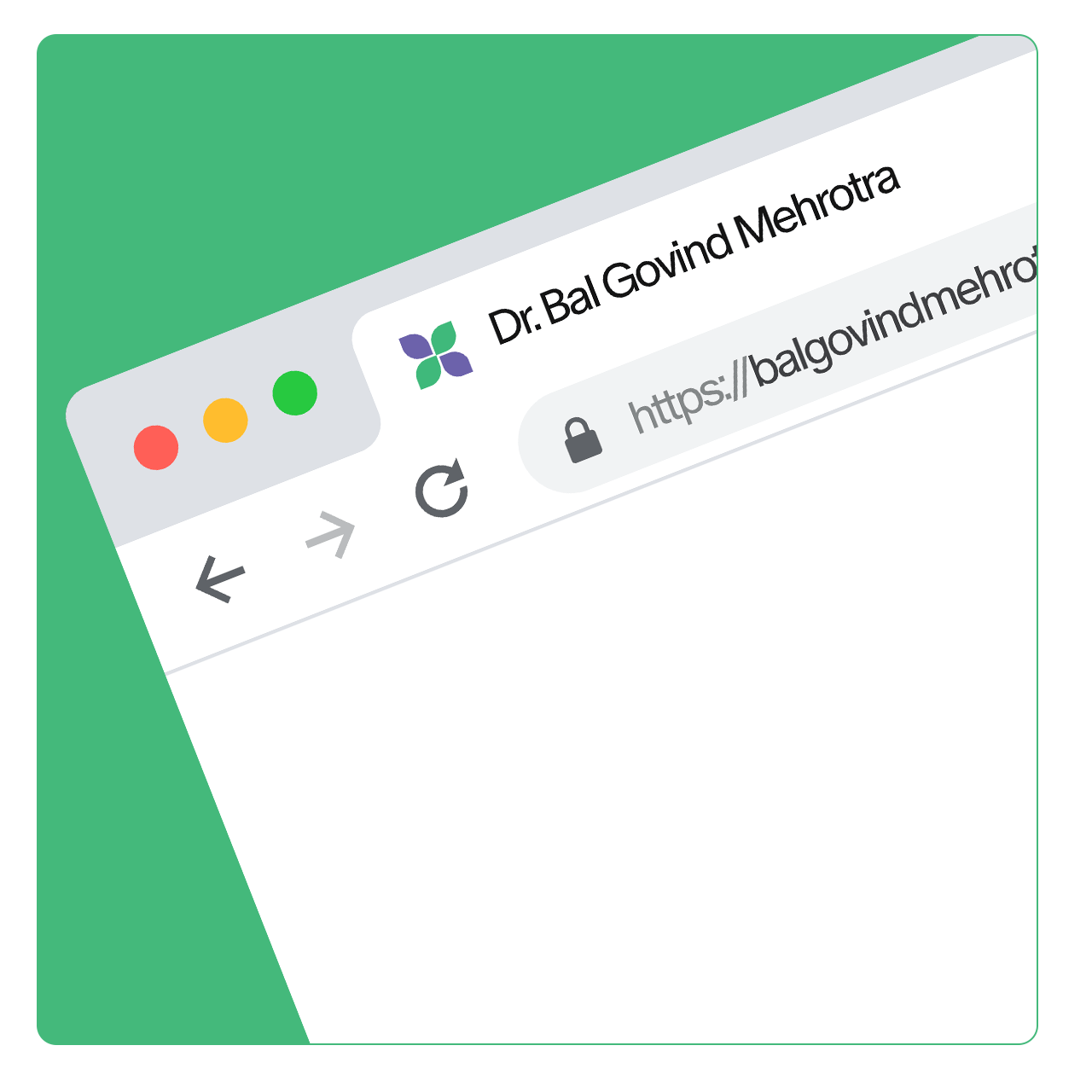
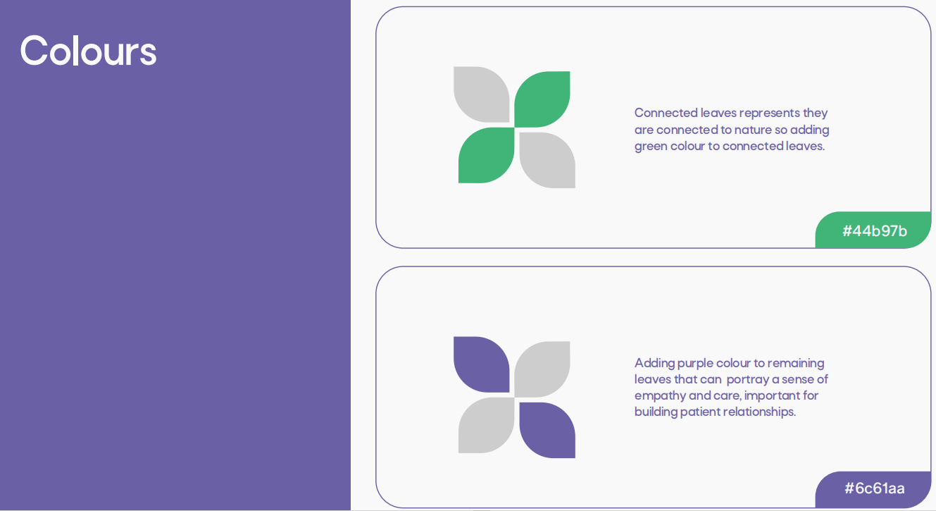
We made a combined logo so that the brand can use it to communicate the clear message. Homeopathy comes from nature so trying to make logo with something related to leaf Negative space makes connecting arrows, look like plus and connecting arrows also represents connection between doctor and their patient. Connected leaves represents they are connected to nature so adding green colour to connected leaves. Adding purple colour to remaining leaves that can portray a sense of empathy and care.
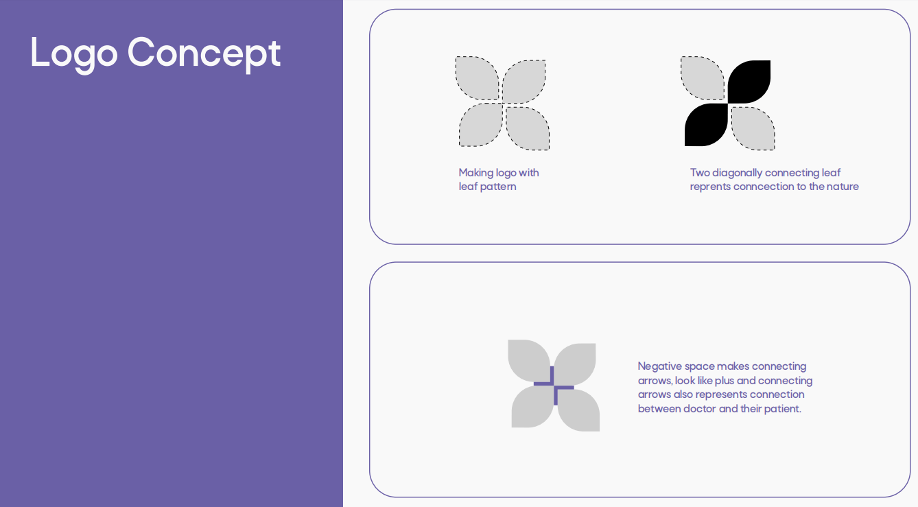
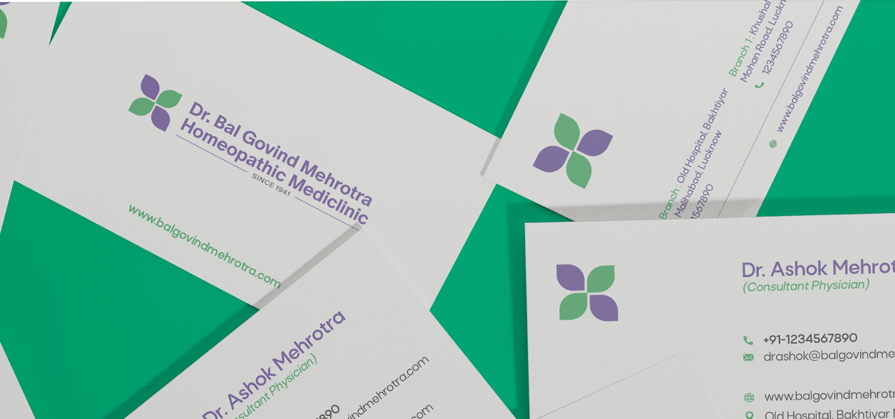
Adding purple colour to remaining leaves that can portray a sense of empathy and care, important for building patient relationships. Connected leaves represents they are connected to nature so adding green colour to connected leaves. Adding purple colour to remainingleaves that can portray a sense of empathy and care.
At Dr. Bal Govind Homeopathic MediClinic, we combine the timeless principles of homeopathy with modern advancements to deliver personalized care for individuals of all ages. Our goal is to not just treat symptoms but address the root cause of ailments, promoting long-lasting health and well-being.
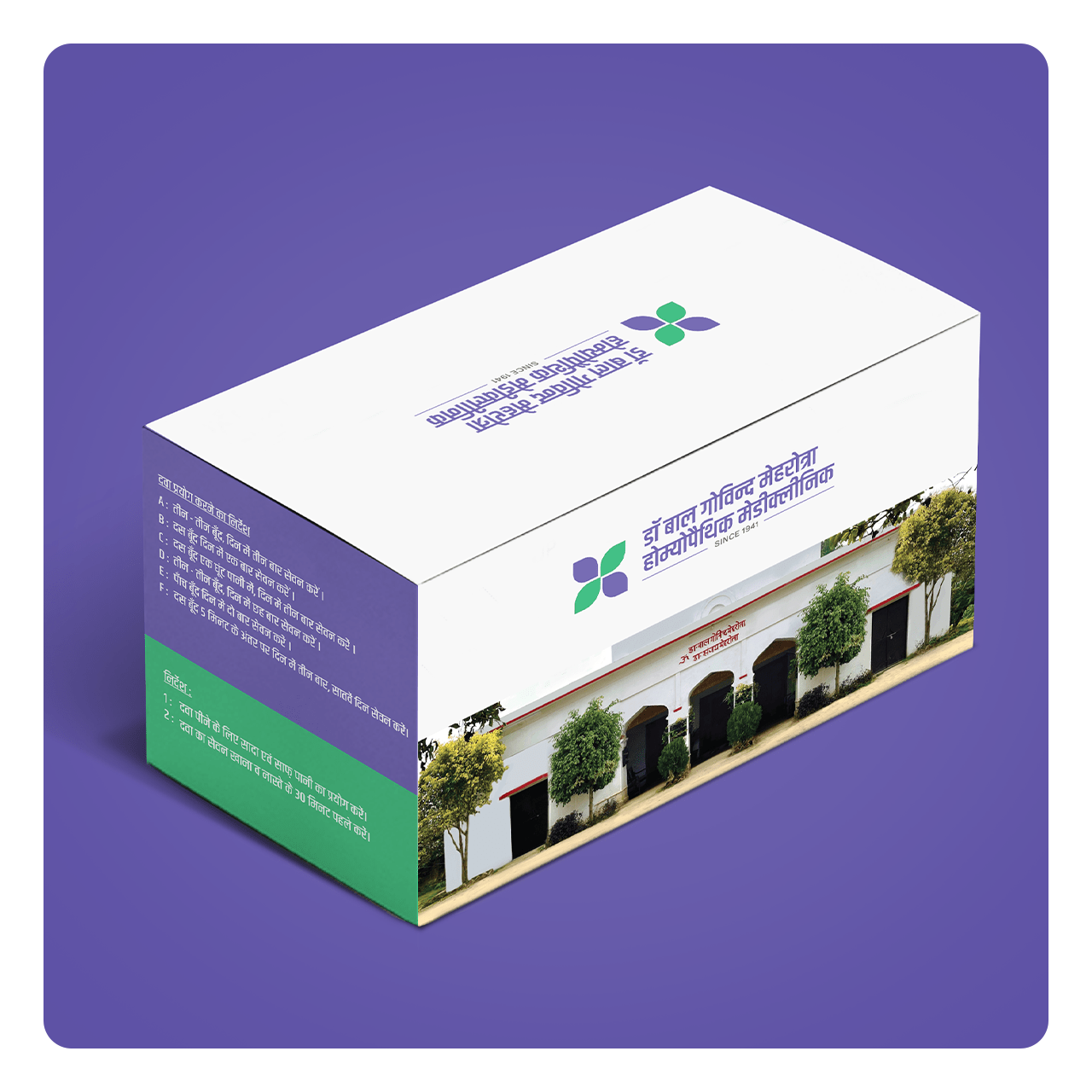
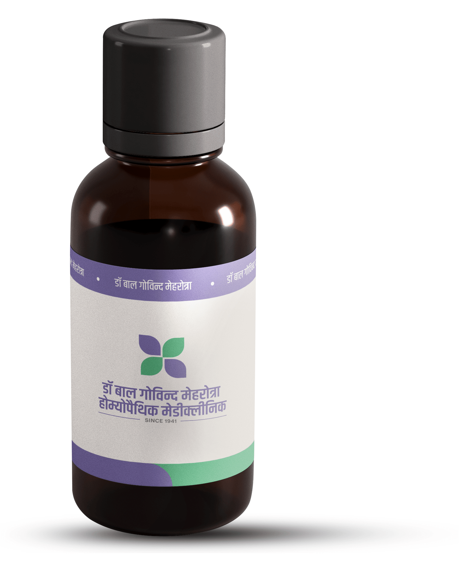
The packaging design for Dr. Bal Govind encapsulates the essence of traditional wisdom blended with modern science. Rooted in Ayurvedic principles, the design reflects a clean, trustworthy, and nature inspired aesthetic that resonates with the brand’s commitment to holistic wellness. The color palette integrates earthy tones deep greens, warm browns, and subtle gold highlights symbolizing purity, healing, and heritage. Hand-drawn botanical illustrations and clean typographic elements lend authenticity and elegance, creating an instant sense of credibility and care.
Every element from the eco-friendly materials to the informative label layout is thoughtfully designed to communicate transparency, efficacy, and a deep respect for nature. The design not only protects the product but also enhances the user experience by conveying trust, tradition, and the healing legacy of Dr. Bal Govind’s formulations.


Our core values remain unchanged. Dr. Bal Govind’s expertise, compassion, and dedication to natural healing continue to guide every aspect of our practice.
Trust & Integrity – Building lasting relationships through honesty, ethics, and transparency.
Holistic Healing – Treating the root cause, not just symptoms, for long-term wellness.
Patient-Centered Care – Prioritizing individual needs with compassionate and personalized treatments.
WhatsApp us
Let’s make your business a brand.
